MyPlan Redesign
Course Planning Made Easy
Work Introduction
What is this site about?
MyPlan Redesign is a demo site that shows how the experience of course finding and planning can be. It have two demo users and several example courses. Users can choose one of them and try searching for courses and editing schedules.
Keyword: Web Development, React Framework
Overview
Context
Problem
Goal
I was planning on taking both a major and a minor, but I’m swaying between two minors. In order to try both area’s classes I have to make several plans.
As I started to make those plans, I found it extremely hard as the current course registration system only allows for one plan at a time. Plus, the schedule builder cannot show class time visually and edit class time as the same time. Due to its outdated design, I wasted so much time and energy trying to make my plans work.
My goal is to redesign and improve the experience of searching courses and editing schedules. Also I want to improve to current site aesthetically.
Time Frame
Mar. 2022 — Jun. 2022
My Role
UI/UX Designer, Full Stack Developer
Platform
Web, Python
Design
Low Fidelity Prototype
The Lo-fi prototype sets the basic layout of the whole website, it will consist of a sidebar, a top bar with the plan selector, and a content frame. The content frame can change it’s content based on the page.
There are two styles of plan selector considered: a horizontal scrolling style (left) and a vertical expand style (right). When doing rapid user research, I found that users tend to peek and glance through all the plans often, which can be achieved by the horizontal style but not the vertical style, as the latter one needs to be expanded to show all the plans. So I kept the horizontal scrolling style for future designs.


Design Requirements
Plans
Add multiple plans, each plan should be individual.
Add classes to a spcific plan
Add, rename, duplicate, and delete plans
Schedule Builder Page
Show schedules on a calendar’s layout
Change course sections on the calendar layout page and see immediate feedback
Courses Page
Search for courses
Filter courses
Course card should show course name, type, intro, and credit
Course Detail Page
Course details should contain the same information as the current myPlan page
Should have a way to visit the current myPlan page

High Fidelity Prototype

Colors
Cherry Blossom is one of the most iconic scene in the University of Washington. I chose an image of the blossom as the background image for the site, and cherry pink as the theme color for my site. Since the cherry trees are “Yoshino cherry varietal”, from Japan, I picked a series of “Nippon” style colors to be my accent colors.

Fonts
I picked Confortaa Semibold for titles and navigation tabs, and Roboto for other elements. Comfortaa is a curvy rounded sans-serif that suits large sizes, its shape and font weight makes it a great combination with the cherry flowers, which also have round paddles. Roboto is used for all other elements, it had good readability and can create a professional look and adds a serious feeling to the site. This is essential for us since this will be the school’s official website. This font has plenty font weight options so its easy to change its importance in places like course descriptions.
Build & Implementation
Actual Site


The Schedule Builder screen, also the home screen, features a calendar layout interactive schedule building system. Users can select different plans, select different courses in these plans, delete courses from plans, and save current selections to plan.
The Search Courses screen, users can search by keywords, course titles, course code, or course type. There’s also a search filter that can help users filter out unwanted courses.
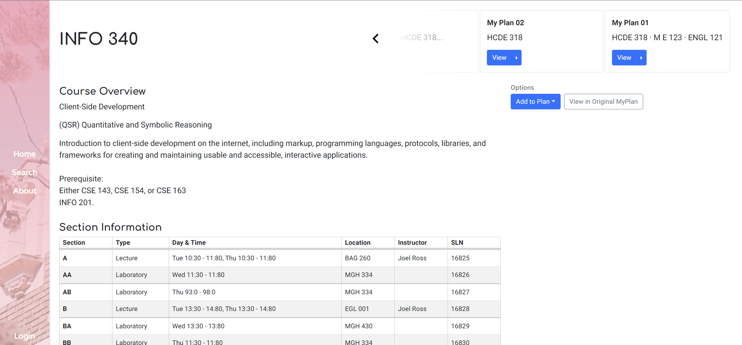
The Course Details screen, this screen contains all the information provided by the department and the instructor. Users can add the current course to their plans or visit the original MyPlan page of the current course.
Highlights
Interactive Schedule Builder
The new schedule builder features an interactive design. The current schedule builder uses time table to display courses but failed to provide any interactivity. The only thing a user can do is choose between pre-generated plans.
I changed the schedule builder to a "buffet" like procedure, where the first user chooses which class to appear on the schedule, and then what section it has. Users can easily switch sections of a class to test different combinations. Then they can easily find out which one fits them best. They can also remove a class from their plan here.
The first picture is the current schedule builder, notice how few the options are. The second one is the redesigned schedule builder, with the ability to select courses, and sections and directly see where they are on the schedule.

React.JS
React is used as the developing framework. It's fast, modular, and efficient. React can also refresh part of the page dynamically like AJAX.
Responsiveness
Responsive design displays different layouts on different screen sizes, allowing mobile, tablet, and computer users to enjoy the same comfortable browsing experience. It also has different animations for different screen sizes. For example, when expanding plans, a larger screen's title will shrink to a smaller size but on mobile, the title will disappear to make sure there's enough space for the plans.
Want to Know More?
Visit the site and try by yourself!